2023-24
BharatGo (Startup)
No-code E-commerce SaaS Platform
Background
BharatGo is a no-code e-commerce platform built for small business owners across India people running local businesses (kirana shops, home bakeries, tailors) who want to sell online but have never built a website. The product promise was simple: get your store live quickly, without needing technical knowledge.
I joined as the sole product designer working directly with the founding team - CEO, CTO, and three full-stack developers across onboarding, dashboards, and core platform features.
As the platform grew its user base, a pattern started emerging: new users were getting stuck, confused, and dropping off during onboarding. The support team was spending time manually helping people complete setup. For a self-serve platform built on the promise of "launch your store in minutes," that was a direct contradiction of the product's core value proposition.
My Role
This project gave me direct experience designing e-commerce surfaces under conversion pressure: onboarding flows, store setup, product listing, pricing flows, and merchant dashboards, all for users with no prior e-commerce or technical experience.
What was mine: All wireframes, all visual design, prototype, iteration cycles, and developer handoff. Design decisions were collaborative, I worked directly with the CEO and CTO on what to build and why.
The team: CEO (product direction), CTO (technical decisions and feature ideas), 3 full-stack developers (implementation and technical constraints).
No other designers. I was the only design voice on the team.
How the Problem Was Identified
The CEO was the one collecting user feedback through support conversations, marketing events, and direct user interactions. I would accompany the CEO and marketing team to events where we'd meet actual business owners using or evaluating the platform. The feedback wasn't from formal research sessions, it was real conversations with real people.
What kept coming up:
"I'm not getting any clear idea where I'm going — this feels overwhelming."
"The UI is confusing and I'm facing bugs — I can't move forward."
"After filling in so much information I still have to go into the dashboard and do more setup."
That last one was particularly telling, users didn't feel like they'd accomplished anything after completing onboarding, they still felt like they were setting up. The flow wasn't giving them a sense of progress or completion.
The Live Preview Insight
The CTO came to a design review and said: "I saw Trello's onboarding - they show you a live preview of the board as you set it up. We should do something like that."
That was the starting point not a formal feature brief, but a concrete reference to something that had worked elsewhere. My job was to take that idea and figure out how it would actually work for BharatGo's context: first-time business owners on mobile with zero e-commerce experience.
Design process
1. Technical Feasibility Check First
Before designing anything, I had a conversation with the developers to understand technical limitations what could update in real time, what would require a full reload, what was feasible within the current architecture. Designing within those constraints from the start meant fewer surprises during development.
2. Mapping the Critical Path
I worked with the CEO and CTO to answer one question: What is the absolute minimum a user needs to do to have a functioning store?
That exercise is what cut the flow from 8 loosely connected steps to 5 focused progressive stages:
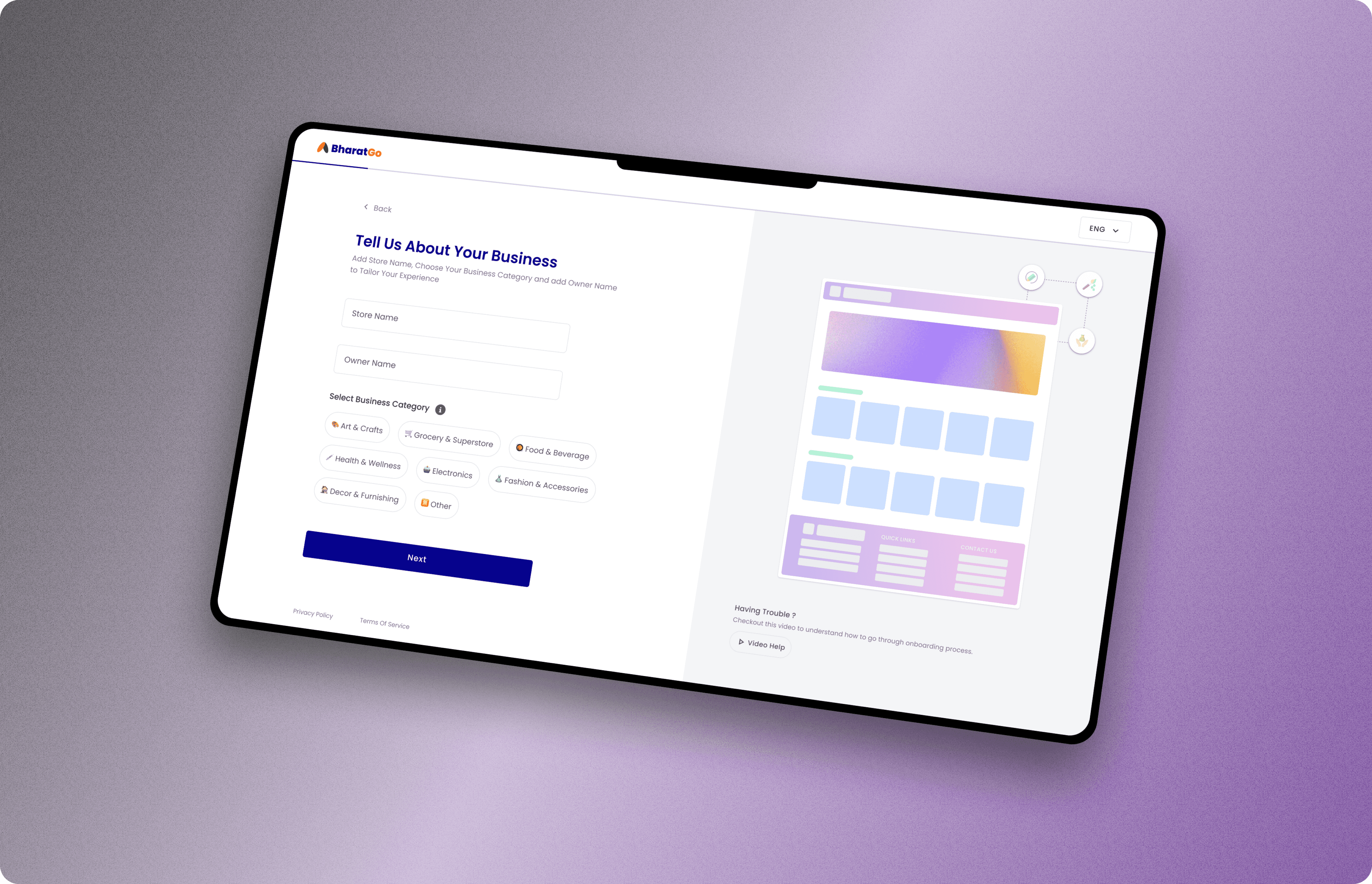
Business setup — store name, category
Branding — logo, colours, basic customization
Contact details — phone, email, address
Product upload — first product (optional)
Pricing plan — select subscription tier
Each stage had one focus and a visible progress indicator so users always knew where they were in the process.
3. Wireframes → Feedback → Iterations
Early wireframes established the structure. The team reviewed, gave feedback, I revised. This happened across a few rounds before reaching high-fidelity. I still have the original onboarding wireframes from this phase they show the evolution from the initial 8-step structure through the various iterations before we landed on the final 5-stage progressive journey.
The live preview in high-fidelity: Once the structure was agreed, I designed the live preview panel in detail — what information it reflected, how it updated as users entered their store name/logo/colours, where it sat on screen, how it behaved on mobile. This went back to the developers to confirm it matched what they could build.
4. Prototype Testing Before Launch
I built a Figma prototype and we tested it with 5–6 new users people who hadn't used BharatGo before. Their feedback was generally positive. A few pointed out minor UI issues (button placement, unclear labels) which I addressed before the design went to development.
No major structural changes came out of that testing the 5-stage flow and the live preview both held up in testing.
Building the Design System from Scratch
Before BharatGo, there was no design system. Every screen was built from scratch. Buttons looked different across features. Colours were chosen ad-hoc. Spacing was inconsistent. When I joined, the product had grown to 8+ core features, but they didn't feel like one product they felt like 8 separate projects stitched together.
My solution: build the design system in parallel with shipping features.
Rather than stopping all feature work to "build a design system first" (which would never get approved at a fast-moving startup), I extracted patterns from the work I was already doing and systematized them as I went.
What I Built
Component Library
I built a library of reusable Figma components covering the most frequently used UI patterns:
Buttons: Primary, secondary, tertiary, destructive — with hover, pressed, disabled, and loading states
Form inputs: Text fields, dropdowns, checkboxes, radio buttons, toggles — all with error, focus, and filled states
Cards: Product cards, merchant dashboard cards, analytics cards — with consistent padding, shadows, and corner radius
Navigation: Top nav, sidebar nav, mobile nav — ensuring navigation felt consistent across the entire platform
Modals and overlays: Confirmation dialogs, info modals, drawer panels
Status indicators: Progress bars, badges, tags, alerts
Design Tokens
I defined the foundational variables that gave BharatGo its visual consistency:
Colour tokens: Primary brand colours, neutral grays, semantic colours (success green, error red, warning amber), and their tints/shades
Typography tokens: Font families, sizes, weights, line heights — ensuring text hierarchy was consistent across all screens
Spacing tokens: 4px base unit with a consistent scale (4, 8, 16, 24, 32, 48, 64px) — every margin and padding followed this system
Elevation tokens: Shadow styles for cards, modals, and floating elements
Interaction Patterns
Beyond static components, I documented interaction patterns that became the platform's interaction language:
Loading states: Skeleton screens, spinners, progressive loading — how the platform communicates "we're working on it"
Empty states: What users see when there's no data yet — designed to be encouraging, not punishing
Error handling: Inline validation, error messages, retry prompts — how the platform guides users when something goes wrong
Success confirmation: Toast notifications, success screens, contextual feedback — celebrating completed actions
Documentation
I created a Figma file that served as the single source of truth for the design system:
Cover page explaining how to use the system
Component library with usage guidelines for each component
Design tokens reference sheet
Do's and Don'ts examples showing correct and incorrect usage
Why This Mattered — Impact Beyond Aesthetics
For developers:
The design system gave them a predictable set of building blocks. Instead of implementing a button from scratch every time, they could reference the button component, see all its states, and implement it once as a reusable React component. This directly accelerated development velocity — developers spent less time translating designs and more time building features.
For consistency:
Before the design system, a user moving from onboarding to the dashboard to product management would encounter different visual languages. After the system, every screen felt like the same product — which builds trust and reduces cognitive load for first-time users.
For my own workflow:
The design system made me faster. Once I'd designed the button system, I never designed another button. I just used the component. When I needed to design a new feature, I was assembling pre-built pieces rather than starting from zero — which let me focus on the hard problems (user flows, information architecture, interaction design) rather than reinventing UI patterns.
What I'd Do Differently
I'd document adoption metrics. I know the design system made development faster — developers told me directly that it was easier to implement features with the system in place. But I didn't track metrics like "time to implement a new feature screen before vs. after the design system" or "number of design clarification questions per sprint before vs. after." If I were doing this again, I'd instrument those metrics from the start so I could quantify the system's impact.
I'd involve developers earlier in the token structure. I built the design tokens based on what made sense to me as a designer — 4px spacing scale, specific colour values. But developers had opinions about how those tokens should be structured in code, and we had to adjust a few things after the fact. Earlier collaboration would have saved a round of refactoring.
What This Taught Me About Systems Thinking
Building a design system taught me a skill that doesn't show up in individual screen designs: designing for scale.
A screen design solves one problem for one moment. A design system solves the same problem once, then makes it reusable across dozens of screens and hundreds of use cases. That shift in thinking — from "what does this screen need" to "what pattern can I create that works everywhere" — is a different kind of design problem, and it's one that matters more as products grow.
That's the lens I bring to every project now: not just "does this screen work," but "can this pattern scale."
Key Design Decisions : What I Actually Solved
1. From 8 Steps to 5 Progressive Stages
Before: 8 loosely connected steps with no clear sense of progress or completion.
After: 5 focused stages, each with one clear objective. Visible progress bar. Users could see how close they were to "done."
2. The Live Preview Feature
The insight: Users commit more once they can see their store taking shape. The live preview showed their store URL, logo, colours, and first product updating in real time as they filled in the form. It turned onboarding from "filling out a form" into "building something real."
Technical implementation: The preview panel sat alongside the form inputs on desktop and appeared as a swipeable preview card on mobile. It updated instantly as users typed made possible by the technical feasibility check I did with developers before designing.
3. Optional Product Upload
In the original flow, users had to add a product before completing onboarding. This was a major drop-off point many business owners hadn't photographed their inventory yet.
The fix: Made product upload optional in Stage 4. Users could skip it and add products later from the dashboard. Added clear messaging: "You can add products anytime from your dashboard."
This single change removed the anxiety of not having photos ready and let users complete onboarding even if they weren't fully prepared.
4. Mobile-First by Default
Every screen was designed for mobile first not as a responsive afterthought, but as the primary experience. Large touch targets, minimal typing, single-column layouts, tap-to-select over type-to-fill wherever possible.
Why this mattered: The vast majority of BharatGo's merchants were using phones, not desktops. Mobile-first wasn't a feature it was the whole point.
After Launch: The Moment That Validated Everything
One moment I remember clearly: a business owner came into the office after using the new onboarding and said:
"The new onboarding is good and fast I completed my store setup while I was in a cab on mobile."
He specifically asked who the designer was.
This wasn't a planned test. This was a real merchant, commuting to work, who opened BharatGo en route and had a live online store by the time he arrived at his destination. No WiFi, no desktop, no support person just a 4G connection and a phone.
That one unsolicited comment from a real user meant more to me than any analytics metric could have. It confirmed the core goal - setup that works on mobile, in the real world, without someone sitting at a desk — had been achieved.
The "cab test" became an informal design review question for everything we shipped after this: "Would this work in a cab?"
Results
The core design metric for this project was conversion — specifically, whether a first-time user could go from signup to a live store without abandoning the flow or requiring support intervention.
Every design decision the 5-stage progressive structure, the live store preview, the single-focus-per-screen approach, the optional product upload was made in service of that conversion goal.
The onboarding flow was reduced from 8 steps to 5 stages
The live preview feature was shipped and worked as designed
Users tested the flow positively in prototype testing before launch
Real business owners used it successfully after launch validated by direct merchant feedback including the cab story
The platform served 500+ active merchants using the redesigned onboarding
The absence of clean analytics doesn't mean the project lacked impact. What it means is I was designing in a fast-moving startup environment where instrumentation wasn't the priority shipping a working product was. The validation came from qualitative signal: user feedback, prototype testing, and real-world usage like the cab story.
In interviews, I can explain this honestly: "We didn't have full analytics instrumentation, but we had strong qualitative signal from real merchants that the redesign solved the core problem users could complete setup quickly, on mobile, without getting stuck."
Reflection
What Worked
Going to marketing events with the CEO and hearing feedback directly from business owners not through a research report, but in real conversation. That kind of direct exposure to users shaped my instincts about what was confusing in ways that no brief could have.
Checking technical feasibility with developers before committing to the live preview feature. This prevented a "great idea that we can't build" scenario and ensured the final design was both good for users and realistic for the team to ship.
What I'd Do Differently
Push earlier for analytics instrumentation on the existing flow. We made good decisions, but we made them based on qualitative signal. Quantitative data even basic funnel tracking would have helped us prioritize which steps to simplify first and measure whether the changes worked.
Test the mobile experience with users on actual phones, not just desktop prototypes. The cab story validated mobile worked, but I wish I'd tested mobile-specific friction points (typing on small keyboards, thumb reachability, low signal scenarios) before launch rather than after.
What This Taught Me
Onboarding is a trust-building exercise. Every step is a micro-commitment the user makes. When they can't see where they're going or what they're building, they stop committing.
The live preview worked because it gave users evidence that their effort was producing something real they could see their store taking shape. That's the insight I carry into every first-time user experience I design now: show progress, not just process.