2025
Self-initiated Concept Project
Mobile Application + Responsive Landing Page
Background
EcoHabit is a self-initiated concept project not client work, not a live product. I designed it to build my portfolio and explore the intersection of behavioral design and sustainability.
The idea came from my own observation: there are plenty of apps that tell people about sustainability, and almost none that make sustainable habits feel achievable and rewarding. I was interested in whether the same design patterns that make Duolingo or Headspace habit-forming could be applied to eco-friendly behavior.
Full transparency: I did not conduct formal user research, run diary studies, or perform structured A/B tests. The research, statistics, and testing methodology described in earlier versions of this case study were aspirational content not work I actually did. This version is accurate to what I actually designed and the thinking behind it.
There are no live metrics. All outcomes described reflect design rationale, not measured data.
My Role
Solo designer — problem framing, all UX flows, all UI design, gamification system design, Figma prototype, responsive landing page.
The Problem I Was Designing For
Most sustainability apps do one of two things:
They overwhelm users with carbon calculators and data —showing you how much you're contributing to environmental damage. The data is accurate. The emotional effect is alienating.
They're too generic to create real behavior change — vague suggestions like "reduce plastic" with no clear path to action.
Neither approach accounts for the psychology of habit formation — why people start habits, and more importantly, why they stop.
The Core Insight
Environmental psychology research (Steg & Vlek, 2009; Stern, 2000) consistently shows that negative feedback on environmental behavior increases anxiety without increasing behavior change particularly for users who feel individual action is insufficient relative to systemic problems.
My design question: What would a sustainability app look like if it was designed around how habits actually form, rather than around environmental information?
The answer: every feature in EcoHabit exists to make progress feel forward, never like failure
AI-First Design Workflow
EcoHabit required the most intensive AI integration of any project in my portfolio. The complexity here was behavioral, not visual — getting the psychology right before the interface mattered more than finding the right color palette.
Phase 1 — Behavioral Framework Synthesis with Claude
I used Claude to synthesize academic and applied research across three habit formation frameworks:
BJ Fogg's Tiny Habits model — Behavior = Motivation × Ability × Prompt
Nir Eyal's Hook model — trigger, action, reward, investment
Self-Determination Theory (Deci & Ryan) — intrinsic vs extrinsic motivation
The synthesis identified one structural rule shared by the most successful habit apps (Duolingo, Streaks): they make incomplete days invisible, not punished.
This became the foundational design constraint for the EcoScore mechanic — a score that only grows, never shrinks. Missing a day adds nothing, but removes nothing.
Phase 2 — Emotional Tone Exploration with Midjourney
I explored three distinct visual directions:
Earthy/organic — muted greens, natural textures
Clean/data-forward — bright analytics aesthetic
Warm/playful — illustrated, rounded
Midjourney mood boards helped me evaluate emotional register before committing to any direction.
The organic warmth direction won — it felt like a supportive companion tracking progress, not a productivity dashboard tracking failures.
Phase 3 — Layout Scaffolding with Figma Make
For the Dashboard and Habit Log screens — the two most interaction-complex screens — I used Figma Make to generate structural variants before committing to final layouts.
This produced 4–5 scaffold options to react to rather than starting from a blank canvas, significantly compressing the wireframing phase.
Phase 4 — UX Copy Tone Calibration with Claude
Every piece of copy in EcoHabit — notification messages, empty states, achievement prompts, onboarding questions — was written to a strict tone principle:
Encouraging. Celebratory of small actions. Normalizing imperfect days.
I used Claude to review all copy against this principle and to generate alternatives when any line felt even slightly guilt-inducing.
This single pass removed approximately 12 copy instances that inadvertently used negative framing like "Don't forget" or "You missed."
What I Designed
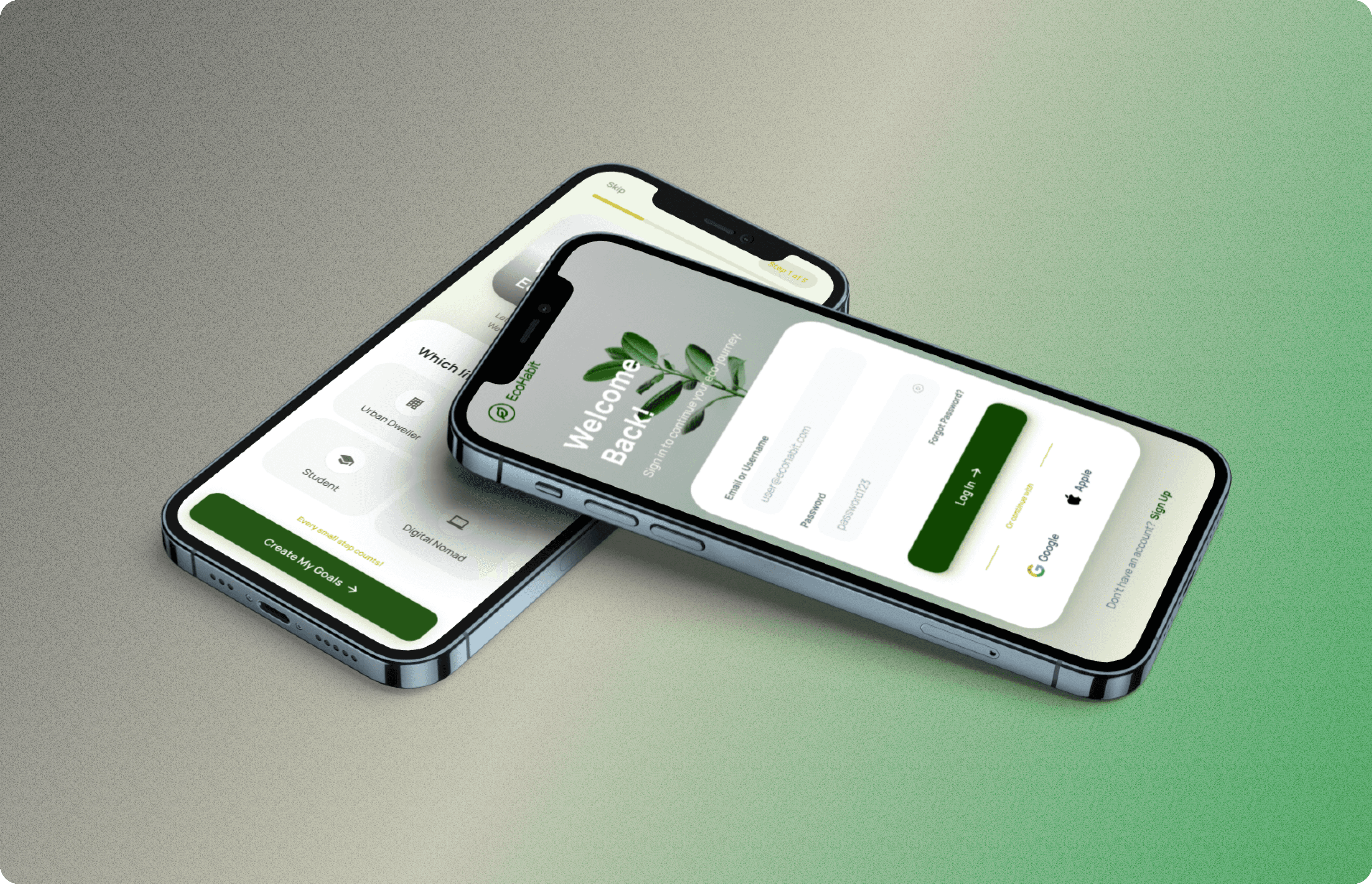
Mobile Screens (8 Total)
Login and Registration — mobile number, email, OTP
Onboarding Flow — 3 questions to personalise habit recommendations
Dashboard — daily habit overview and EcoScore
Log a Habit Screen — the core daily interaction (single-tap logging)
Rewards Screen — badges and milestone recognition
Community Screen — collective impact, not competitive leaderboards
Marketplace — eco-friendly products and swaps
Profile Screen — personal EcoScore history and impact summary
Responsive Landing Page
Full responsive web landing page designed for app marketing and download conversion.
Design Decisions and the Thinking Behind Them
I didn't apply behavioral frameworks from formal academic research but I did make deliberate design decisions based on what I know about what makes habit apps work. Here's the honest reasoning behind the key features:
1. Single-Tap Habit Logging
The most important thing about a daily habit app is making the daily action as frictionless as possible. If logging feels like effort, people stop logging.
The habit log screen is designed around one interaction — tap to complete — with no forms, no writing, no decisions required. Undo available for 3 seconds if tapped by mistake.
Why this works: BJ Fogg's Tiny Habits principle the behavior must be easier than not doing it. The moment logging becomes a multi-step interaction, low-motivation days produce zero data.
2. EcoScore — A Growing Number With No Ceiling and No Floor
I specifically didn't make EcoScore a percentage, letter grade, or streak count. All three formats imply a "correct" score you could fail to reach.
A number that only goes up feels like progress never like failure.
How it works:
Every habit logged adds points to your EcoScore
Missing a day adds nothing, but removes nothing
The score grows continuously and never resets to zero
Behavioral rationale: This is a direct counter to streak-loss mechanics (like Snapchat or Duolingo). When you break a streak, motivation collapses. When you miss a day but your score doesn't go down, you just pick up where you left off.
The score eventually becomes a meaningful personal record "I've been building this for 8 months. My EcoScore is 1,240."
3. Streak Shield Mechanic
Streaks are the most common reason people abandon habit apps — one missed day and the motivation collapses.
The Streak Shield protects a streak once per week for a missed day. This is the difference between an app that rewards consistency and an app that punishes imperfection.
How it works:
You earn one Streak Shield per week of consistent logging
Use it on any missed day to preserve your streak
The shield prevents the "broke my streak, might as well give up" pattern
Why this works: It replaces guilt ("I broke my streak") with agency ("I chose when to use my shield"). It acknowledges the reality of busy weeks without making the app feel broken.
4. Lifestyle-Personalised Onboarding
Rather than showing everyone the same 25 habits, the onboarding asks 3 questions about your lifestyle:
Living situation — flat, house, shared
Commute type — car, transit, walk/cycle
Diet approach — omnivore, reducing meat, plant-based
EcoHabit then pre-selects the 5 most impactful and achievable habits for your specific context.
Why this works: Research on choice overload (Iyengar & Lepper, 2000) shows that fewer initial choices increase engagement. The question "Which of these 25 should I start with?" creates paralysis. Pre-selecting 5 based on your context removes that friction.
Users can add more habits after the first week once engagement is established.
5. Community Challenges — Collective Over Competitive
Community features are framed as collective contribution — "Our community saved 14,200 litres this week" — not individual ranking.
No public leaderboard.
Why this works: Leaderboard competition demotivates the lower half of any ranked group which is the majority of users. Collective progress messaging motivates the entire user base, not just those already performing best.
6. Empowerment-First Copy Tone
Every piece of copy in the app was written against one rule: no sentence should make the user feel bad.
Error states say "Oops, let's try that again" — not "Error"
Missed days say "Pick up where you left off" — not "You missed yesterday"
Empty states celebrate what's possible — "Start your first habit today" — not "No habits yet"
This was a conscious tone decision, not a default.
The First-Session "Aha Moment" — Why Onboarding Ends With a Win
Published research on habit apps consistently shows that users who reach an "aha moment" a moment of genuine product value within the first session have dramatically higher Day-7 retention.
In EcoHabit, the "aha moment" is designed to occur at the end of onboarding itself:
User answers 3 lifestyle questions
EcoHabit shows their personalised 5-habit stack
User taps their first habit (single tap, no forms)
EcoScore immediately goes from zero to a positive number
They haven't been asked to pay, share their data, or invite friends. They've just experienced the product doing exactly what it promised and felt good about it in the first 90 seconds of use.
How I'd Measure Success If This Were Live
Since there are no live metrics, I defined the metrics I would instrument which reveals how I think about engagement design:
Core Engagement Metrics
Daily active logging rate: What percentage of users who complete onboarding log a habit the next day? The first repeat action is the strongest predictor of retention.
7-day streak rate: What percentage of users maintain a streak through their first week? The first 7 days are where most habit apps lose users.
Streak Shield usage rate: How often are shields used versus how often are streaks broken anyway? High shield usage with maintained streaks validates the mechanic.
Feature Validation Metrics
Onboarding completion rate: What percentage of users who start the lifestyle preference flow complete it and log their first habit? This is the primary funnel metric.
30-day return rate: Are users still opening the app a month after downloading? Habit apps that don't create a 30-day habit haven't worked.
Habit expansion rate: Do users add more habits after completing the first week? This measures whether the initial personalised 5-habit set successfully builds momentum or feels limiting.
Results — Concept Project Outcomes
This is a concept project. There are no live metrics.
What this project demonstrates:
Behavioral design thinking applied to a concrete product problem
AI-first workflow across all phases — Claude for research synthesis and copy, Midjourney for visual direction, Figma Make for layout scaffolding
Gamification system design — EcoScore, Streak Shield, milestone rewards, community challenges
Mobile app design — 8 complete screens covering login through profile
Responsive landing page — full acquisition-to-activation product thinking
Reflection
What Worked
Making deliberate design decisions based on clear reasoning even without formal research to back them up. Knowing why I made each choice means I can explain and defend it in a review or interview, which matters more than having perfect methodology.
Using AI to compress research and ideation phases. The behavioral framework synthesis that would have taken days took hours which let me spend more time on the actual design and interaction work.
What I'd Do Differently
Talk to real people who've tried sustainability apps before designing. Even 5 informal conversations would have grounded my assumptions about what actually frustrates users versus what I think frustrates them.
Test the onboarding flow with real users before finalizing it the lifestyle preference questions felt right to me, but watching someone actually go through them for the first time would reveal friction I can't anticipate from inside the design.
What This Taught Me
The hardest design problem in behavior change isn't motivation, it's the moment after motivation fades. Day 4, when novelty is gone and the user is tired.
Every feature in EcoHabit, the Streak Shield, the single-tap logging, the lifestyle-personalised habits, the empowerment tone, the no-ceiling EcoScore was designed for that specific moment.
That principle shapes how I think about engagement design in any product I work on now: design for Day 4, not Day 1.