2025-26
Navi Mumbai Municipal Corporation (NMMC)
Internal ERP Dashboard (Government Administrative System)
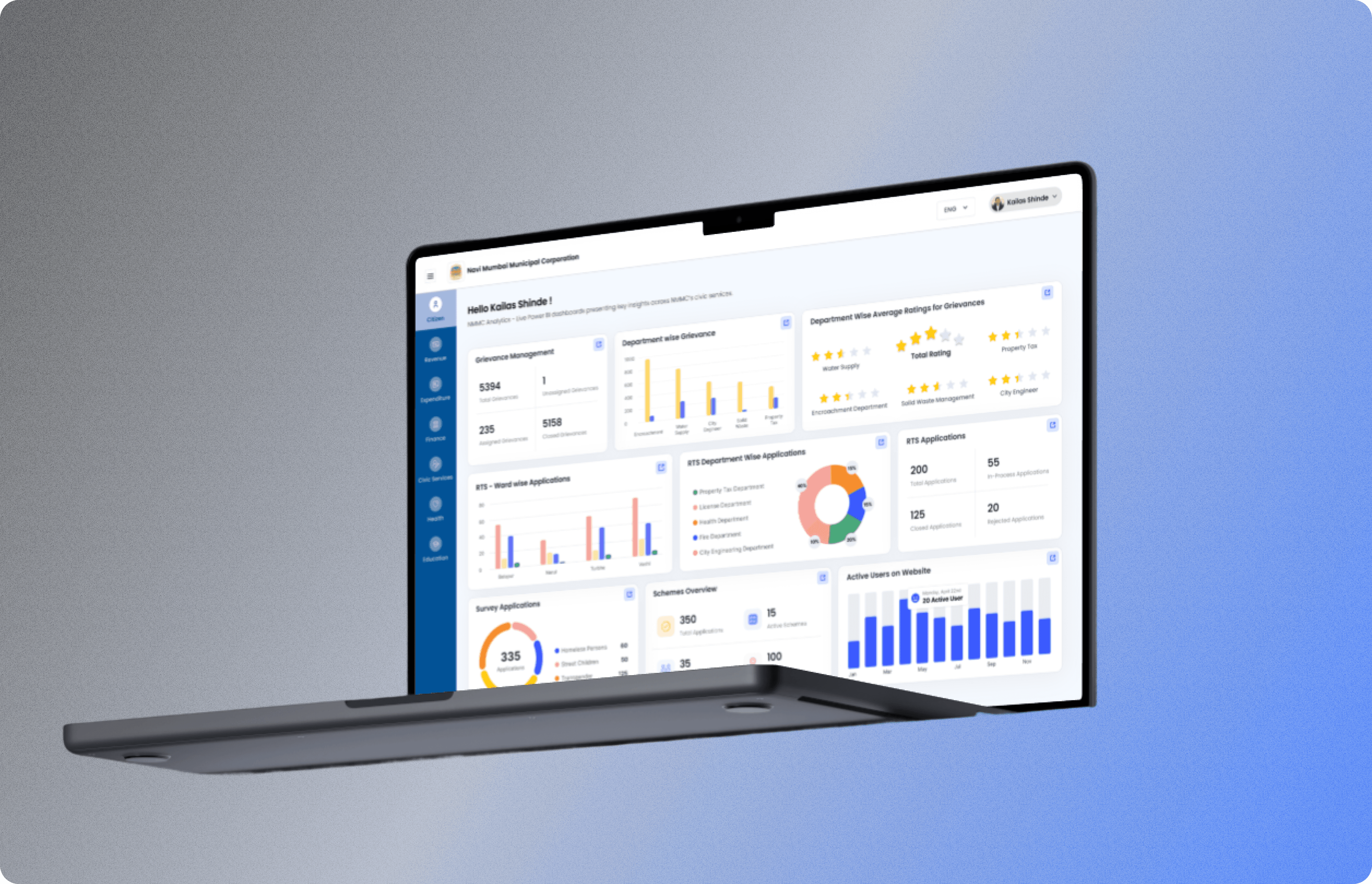
Background
Navi Mumbai Municipal Corporation serves approximately 2.6 million citizens across 7 ward nodes and 10 operational departments - Health, Water Supply, Engineering, Waste Management, Finance, Education, Estate, Smart City, Civic Services, and Administration.
Before this project, the Commissioner's office received operational updates from each department in a different format: printed reports, Excel files sent by email, WhatsApp messages, and verbal briefings. Leadership was manually synthesising over twenty separate information sources every morning to understand what was happening across the city. There was no single source of truth, no real-time visibility, and no way to identify cross-departmental patterns without physically correlating data from multiple documents.
The existing dashboard was fragmented each department lived on its own separate page. The Commissioner had to navigate between pages to get a complete picture. What was needed: a unified, single-page executive dashboard where all ten departments were visible at once, with the ability to drill into any module for detailed information without losing the overview.
I was brought in as the sole designer at Probity Soft to redesign this system, taking it from a multi-page fragmented structure to a unified single-page executive interface.
My Role
What was mine: All design decisions end-to-end, information architecture, layout exploration, visual design, component design, iteration cycles based on feedback, and developer handoff assets.
The team around me: Director, Tech Lead, Project Manager, and developers. No other designers. No design manager. I was the sole design voice on the project.
How decisions moved: I presented designs to the internal Probity Soft team. They took designs to the Commissioner's office for stakeholder review, then brought feedback back to me. I never had direct access to the Commissioner's office, all feedback came filtered through the project team. This is standard in government contracts where the vendor (Probity Soft) acts as the interface between the designer and the client (NMMC).
Discovery & Research
This was a requirements-first project, not a research-first project which is how most real government and enterprise work actually happens. The project team came with a clear brief and concrete references rather than asking me to start from discovery.
All department sections needed to consolidate onto one single page instead of separate pages per department
Every data card needed to be clickable, opening a detailed view of that module's data
A specific layout structure was already in mind for how sections should be arranged
Because the backend used Power BI for analytics, specific chart and graph types were required bar charts, line graphs, KPI cards chosen deliberately so developers could implement them using Power BI components without custom visualization work
The team pulled reference images from Google dashboards with a similar visual style and colour palette and said: "We want something like this."
This gave me a concrete visual direction and technical constraints to start from, rather than a blank canvas.
What I Learned Through Contextual Inquiry
Even with a requirements-first brief, I needed to understand how the system would actually be used:
Fragmented data ecosystem: Each of the 10 departments maintained separate systems — RTS Portal, Property Tax System, Water Billing, Grievance Redressal, Employee Management — with no unified view and inconsistent data formats across departments.
Time-critical decision-making: The Commissioner needed to respond to citizen grievances, fire incidents, and health emergencies within hours. Manual report compilation created delays in exactly the situations where speed mattered most.
Variable digital literacy: Users ranged from tech-fluent young officers to senior officials who preferred clean, scannable visualizations over complex data tables. The design had to work for both ends of that spectrum.
Government-specific constraints: Statutory terminology requirements, multi-tier approval cycles, low-resolution government-issued monitors (commonly 1366×768), and print-first mental models from years of paper-based workflows.
Design Process
I studied the original dashboard, the reference images the team provided, and the Power BI chart types they needed. I mapped out all the departments' data points and how they could be structured on a single page without overwhelming the viewer.
The most significant design challenge: how do you organize ten departments' worth of data, each producing fundamentally different information — on one screen without creating an unreadable data wall?
Full Project Scope — Beyond the Dashboard
The Commissioner Dashboard is the most visible output — but it wasn't the only deliverable. My work at Probity Soft for NMMC included designing a complete digital product suite for the municipal corporation:
What I Designed
1. Executive Dashboard (Commissioner-level)
The unified 10-department real-time interface, the primary deliverable and the focus of this case study.
2. Operational Dashboard with Multi-Stage Forms
A separate dashboard for department heads to input operational data, approve workflows, and manage day-to-day processes. This included designing multi-stage forms with conditional logic, different form paths based on user role, department, and data type.
3. Landing Page
A public-facing landing page for NMMC's digital services portal, the entry point citizens use to access government services online. Designed for accessibility, multilingual support (English, Hindi, Marathi), and responsive layouts optimized for both desktop and mobile.
4. Citizen Service Workflows
End-to-end service request flows from citizen submission through department review and status updates. These workflows connected multiple departments and required designing for various user types: citizens, ward officers, department approvers, and administrators.
GIGW Compliance — A Design Constraint That Shaped Every Decision
From day one, I was briefed to design all interfaces in compliance with GIGW — Guidelines for Indian Government Websites and Apps (https://guidelines.india.gov.in/). This isn't optional guidance, it's a mandatory design standard for all government digital platforms in India.
GIGW mandates specific requirements:
Accessibility: WCAG 2.0 Level A compliance minimum (I designed to WCAG 2.2 AA)
Multilingual support: All interfaces must support at least English and Hindi; for Maharashtra state projects like NMMC, Marathi is also required
Responsive design: Must work on desktop, tablet, and mobile
Progressive enhancement: Core functionality must work without JavaScript
Security and privacy: Specific data handling protocols for citizen information
Performance: Page load time limits for low-bandwidth environments
Why this matters for design decisions:
GIGW compliance shaped every layout, every interaction pattern, every colour choice. For example:
Colour contrast ratios had to meet WCAG AA standards, no subtle greys, no low-contrast text
Touch targets had to be minimum 44×44px, particularly critical for the kiosk interface where users interact with physical touchscreens
Navigation patterns had to be simple enough to work across three languages with different text lengths
Form design had to include clear error states, field labels, and help text — because many NMMC users are first-time digital service users
This constraint is why I can confidently design for accessibility-first environments, I've been doing it under regulatory mandate for government-scale systems serving thousands of daily users.
How This Changes the Scope Perception
The Commissioner Dashboard is the flagship deliverable, it's what the Commissioner's office uses every morning, and it's the most strategically visible component.
But the full NMMC engagement was a systems design project, not a single-dashboard project. I was designing interconnected components, dashboards, forms, workflows, public pages, and physical kiosks that had to work together as a cohesive digital ecosystem while meeting government compliance standards.
This is the kind of complexity and constraint management that translates directly to enterprise SaaS, fintech, and healthcare design, domains where regulatory compliance, multi-user workflows, and accessibility aren't optional features, they're table stakes.
Information Architecture — Department Grouping by Urgency
Through conversations with the project team about what the Commissioner's office prioritized in morning briefings, I grouped the ten departments into three tiers by operational urgency:
Tier 1 — Immediate Attention (primary viewport):
Health (outbreak alerts, ambulance status), Water (supply disruptions), Waste (collection failures). These departments produce the issues most likely to require same-day executive decisions. Displayed as prominent status cards with RAG (Red/Amber/Green) indicators visible without scrolling.
Tier 2 — Daily Operational Review (secondary cards):
Engineering (active projects), Civic Services (complaint volumes), Smart City (sensor alerts). Updated hourly. Requires review but rarely demands immediate action.
Tier 3 — Strategic Oversight (summary KPIs):
Finance, Education, Estate, and Administration. Summary-level data with drill-down access. Updated daily. Reviewed in weekly briefings rather than daily standups.
Why This Structure Works
The Commissioner can scan Tier 1 status in under 5 minutes without scrolling or navigation
Tier 2 and Tier 3 are visible on the same page, just lower in the hierarchy
Every card links to a detailed module page, I designed both the overview layer and the drill-down layer so the information architecture was consistent across all 10 departments
Design Iterations
Round 1: First layout explorations following the structure the team had in mind. Feedback came back after the team reviewed internally and took it to the Commissioner's office. Changes were mostly structural which sections should be more prominent, how cards should be grouped, how much detail to show on the overview versus the drill-down.
Round 2: Revised layouts incorporating Commissioner-side feedback. At this stage feedback became more detailed and specific modules that needed to move, card sizes, colour adjustments, and ensuring the Power BI chart types were represented correctly so developers had no ambiguity during implementation.
Round 3: Final refinements. Small adjustments, component-level fixes, and handoff preparation. The team confirmed this version was approved.
Throughout, I worked closely with developers to make sure design decisions were buildable — checking which layouts were feasible, which interactions were within scope, and ensuring chart specifications matched what Power BI could actually render.
Key Design Decisions: What I Actually Solved
1. The Fragmentation Problem
Before: The original system required navigation across multiple pages to see different departments.
After: The redesigned dashboard put everything on one page with a clear visual hierarchy, Tier 1 overview cards at the top, Tier 2 and Tier 3 modules below, all clickable to open detailed department views without leaving the dashboard context.
2. The Drill-Down Structure
Every card on the overview links to a detailed module page showing that department's full operational data. I designed both layers the summary card (what the Commissioner sees first) and the detailed view (what they see on click) so the information architecture was consistent across all 10 departments. This meant building a reusable card component structure that could be populated with different department data.
3. Power BI Integration as a Design Constraint
Because the charts needed to be Power BI-compatible, I designed with those constraints from the start rather than discovering them later during development. Every chart type I specified bar charts, line graphs, KPI metric cards, status indicators was one the developers could implement directly using Power BI's native components. This eliminated the "design looks great but we can't build it" problem that kills timelines in government projects.
4. Design System for Ongoing Work
The dashboard is live and in active use but it's not a closed project. The Commissioner periodically requests new sections or flags issues. When that happens, I design the new components or modules and the developers implement them.
To support this ongoing relationship, I built a reusable Figma component library specifically for the NMMC product suite, status chips (RAG system), data cards, drill-down tables, alert banners, and navigation components. This system serves not just the Commissioner Dashboard but all 15+ government modules I'm designing concurrently at Probity Soft.
Impact of the design system: Estimated ~30% reduction in design-to-developer handoff time across the product suite measured by the reduction in developer clarification questions per module after the library was established.
How I Cut Stakeholder Revision Rounds from ~5 to ~2
The most operationally significant constraint in government projects is the revision cycle problem. Every design review involves multiple stakeholders from different departments, each with different expectations and different authority to approve. The standard process at the start of this engagement was approximately five rounds of feedback per module — each round requiring a full presentation, collected feedback, redesign, and re-submission.
My Approach: Structured Pre-Design Alignment
Rather than starting with wireframes and reacting to feedback, I created structured documentation before visual design began:
User flow diagrams first, wireframes second: I presented Figma flow diagrams showing screen states, decision trees, and data dependencies before any visual design. Stakeholders could respond to logic without evaluating aesthetics, which removed the most subjective feedback loop.
Data inventory table: A spreadsheet mapping every data field the interface would display its source department, update frequency, and the stakeholder responsible for data accuracy. This prevented late-stage surprises about data availability.
Statutory terminology log: A running document of mandatory field names and statutory language that the design could not deviate from. Referenced in every review to prevent "we need to change this term" feedback in Round 4.
Structured review template: Sent to stakeholders before each presentation, organizing feedback by category (logic, content, visual) rather than allowing free-form comments. This dramatically reduced conflicting feedback between departments.
Outcome: Revision rounds dropped from approximately 5 to approximately 2 per module a ~60% reduction. This was tracked informally by counting feedback sessions per module in the Notion project log maintained throughout the engagement.
Results
The dashboard is live at NMMC and actively used by the Commissioner's office.
I don't have access to formal before/after usage metrics — feedback came through the project team rather than directly from the Commissioner's office, which is standard for vendor-client relationships in government contracts.
The fact that the Commissioner continues to request new sections and improvements is itself a signal that the system is embedded in real workflows — government dashboards that don't get used don't get iterated on.
10 departments unified in a single real-time interface
20+ fragmented manual reports replaced by the live dashboard
~60% reduction in stakeholder revision rounds per module (from ~5 to ~2 rounds)
~30% reduction in design-to-developer handoff time across the product suite (estimated from reduction in developer clarification questions after design system rollout)
Live in production : The Commissioner uses the dashboard in review meetings
The goal of consolidating all 10 departments onto one page without navigation was achieved
The dashboard replaced over 20 fragmented daily manual reports
The Commissioner continues to request new sections and improvements, which signals the system is embedded in real workflows. Government dashboards that don't get used don't get iterated on.
Reflection
What worked: Starting with the team's reference images and layout requirements rather than ignoring them. In government projects, stakeholders often have strong mental models of what they want. Working with that starting point and improving it rather than presenting a completely different direction created faster alignment and fewer wasted iterations.
Power BI as a design constraint, not a post-design surprise. Knowing the technical constraints upfront meant every chart type I specified was one the developers could implement directly. No "we can't build this" surprises.
What I'd do differently: Push for at least one direct touchpoint with the Commissioner's office rather than receiving all feedback filtered through the project team. Feedback loses nuance through layers. Something the Commissioner meant as a minor preference sometimes came back to me as a hard requirement, and vice versa. One 30-minute alignment session would have saved multiple rounds of revision.
What this taught me: Real enterprise design is requirements-first, not research-first. The skill isn't running ideal discovery processes in controlled conditions, it's translating what stakeholders tell you into design decisions that actually work for the users they represent. Learning to work within those constraints while still improving the experience is a different skill than portfolio projects teach you, and it's the skill that matters most when you're designing systems that thousands of people depend on every day.