2025-26
Self-initiated Concept Project
Sustainable Fashion E-commerce Platform
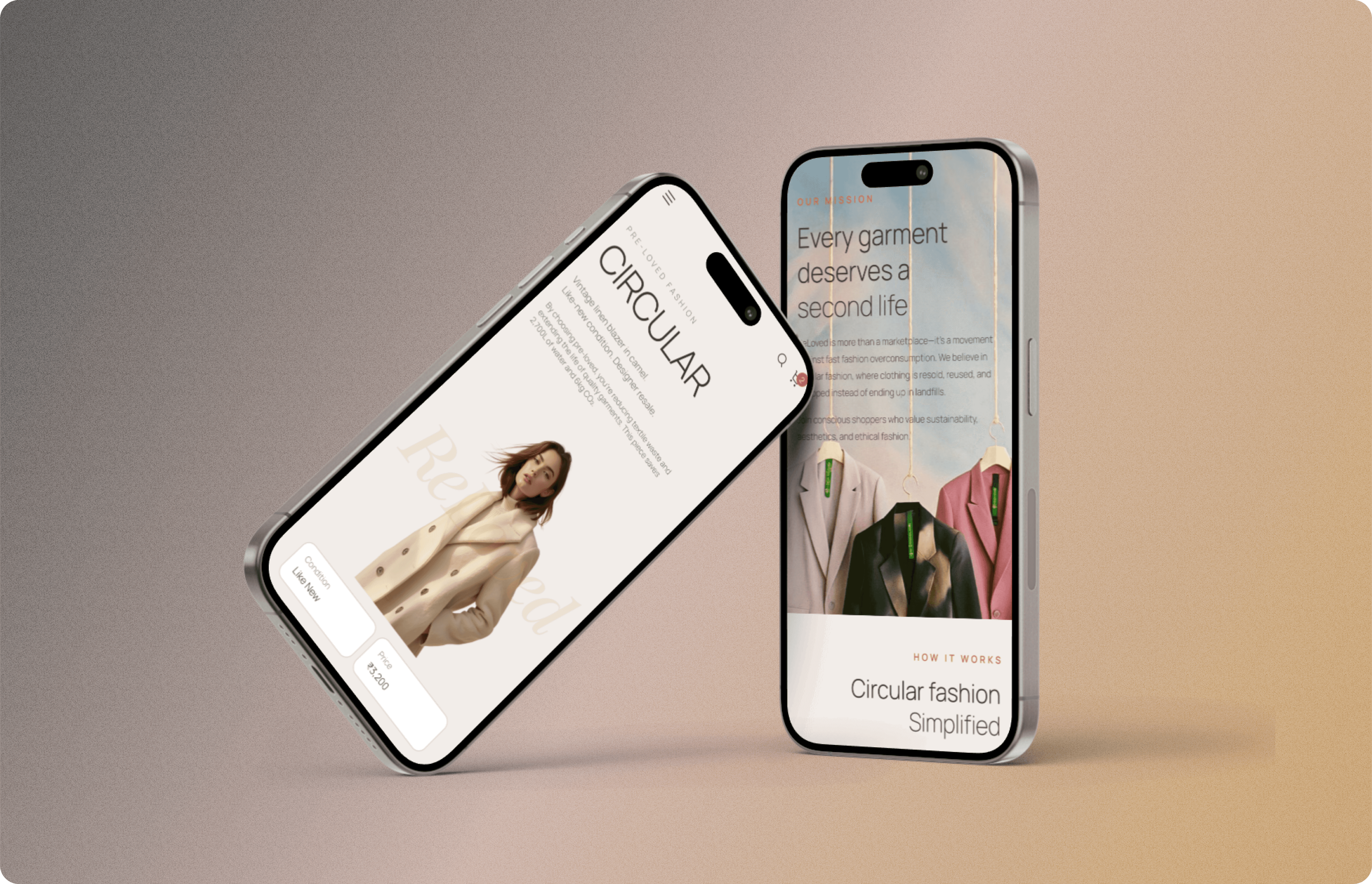
Background
ReLoved is a self-initiated concept project not client work, not a live product. I designed it to build my portfolio and explore a problem space I found genuinely interesting: why do sustainable fashion platforms underperform despite clear consumer intent toward sustainability?
The project brief came from AI-assisted ideation, I used ChatGPT to help me identify a problem space worth designing for and structure the brief. The design work all screens, flows, interactions, the design system, and the prototype is entirely my own.
This project gave me hands-on experience designing the full e-commerce conversion funnel discovery, product detail, add to cart, checkout, and post-purchase with trust-building and conversion as the primary design objectives at every screen.
My Role
Solo designer brief definition, all UX flows, all UI design, design system, Figma prototype.
The Problem Space
Sustainable fashion has a demand problem on the surface but look closer and it's an experience problem. Consumers say they want to shop sustainably. Resale platforms exist. And yet adoption remains low.
The hypothesis I set out to design around: Resale platforms feel like either a flea market or a chore. They're built for function, not for desire. If a platform could make second-hand feel as premium and trustworthy as buying new, the demand is already there.
Secondary Research — Three Consistent Barriers
I synthesized published research from ThredUp's Annual Resale Report (2023), Depop buyer surveys, and Vinted's published conversion insights. Three barriers appeared consistently:
Quality uncertainty — "Is this item actually in the condition described?" Buyers can't trust seller-stated condition.
Stigma perception — "This feels like buying someone's old clothes." The visual language of most resale platforms reinforces this.
Impact ambiguity — "I want to be sustainable but I can't see my actual impact." Sustainability claims are buried in About pages, not visible at the point of purchase decision.
These three barriers became my design brief, every major feature exists to solve one of these problems.
AI-First Design Workflow
ReLoved was my first project where I embedded AI tools into every phase of the design process, not just execution. This workflow is now standard practice in how I approach concept projects.
Phase 1 — Problem Framing with ChatGPT
I used ChatGPT to help me narrow down a problem space worth designing for. I gave it my interests (sustainability, e-commerce, behavioral design) and asked it to suggest 5 underserved design problems in that intersection. "Resale platform trust barriers" emerged as the most concrete, designable problem.
ChatGPT also helped me structure the brief defining success metrics I'd track if this were live, the user personas I'd design for, and the competitive landscape to research.
Phase 2 — Competitive Synthesis with Claude
I used Claude to rapidly analyze five existing resale platforms Depop, Vinted, ThredUp, Vestiaire Collective, eBay Fashion mapping their visual positioning, tone of voice, and conversion messaging approach.
The analysis identified a consistent gap: Every platform used a bargain-hunt visual aesthetic (dense grids, price-first layout, filter sidebars) that undermined premium positioning. This became the core design opportunity: what if the visual language felt more like a fashion brand than a classifieds site?
Phase 3 — Visual Direction with Midjourney
I generated 30+ visual mood references in Midjourney exploring "premium secondhand fashion editorial" testing dark editorial, clean minimal, warm craft, and maximalist vintage directions.
The warm editorial direction won — muted earthy palette, generous whitespace, campaign-style photography language because it felt like a curated fashion experience, not a bargain hunt.
Phase 4 — Layout Scaffolding with Figma Make
For the product listing, product detail, and checkout screens, I used Figma Make to generate initial layout structures producing 4–5 structural variants to evaluate before committing.
This compressed the wireframing phase and let me focus creative energy on the differentiating elements: eco-impact indicator placement, seller trust signal design, and the wardrobe swap feature.
Phase 5 — UX Copy with Claude
All UX copy — empty states, eco-impact labels, trust signal text, onboarding prompts — was drafted and tone-reviewed using Claude against one principle: aspirational and empowering, never guilt-driven.
Every line was tested against: "Does this make the user feel good about buying secondhand, or does it remind them of what they're avoiding?"
Design Principles
Before designing any screens, I set three principles every decision would be evaluated against:
1. Premium Over Bargain
The visual language had to feel closer to a modern fashion brand than a classifieds site. Large imagery, editorial-style layouts, clean typography. The goal was to make second-hand feel aspirational, not remedial.
2. Trust at Every Touchpoint
Standardized condition labels (Like New, Very Good, Good, Loved), multiple product images from consistent angles, visible seller history and ratings. Buyers needed confidence before committing to a purchase from someone they'd never met.
3. Sustainability as Context, Not Lecture
Eco-impact data (water saved, CO₂ reduced, garments diverted) appears at decision moments on the product detail page, at checkout, at swap confirmation not as a homepage banner users scroll past.
The Wardrobe Swap Feature — What Differentiates ReLoved
This is the feature that differentiates ReLoved from existing resale platforms.
The Insight Behind It
Not every seller wants money. Some users just want different clothes, they'd rather exchange a dress they've stopped wearing for something new-to-them, without dealing with pricing decisions, payment processing, or waiting for bank transfers.
No major resale platform I looked at had addressed this directly.
How It Works
Sellers can tag items as "swap only," "swap or sell," or "sell only"
Buyers browsing swap-eligible items can send a swap request by selecting an item from their own wardrobe to offer in exchange
The seller reviews the offer the item, condition photos, and details and accepts, declines, or counters
Both parties ship simultaneously
The escrow-hold logic mirrors how Airbnb handles payment release confirming receipt before finalizing the exchange
Eco-impact data appears at the confirmation screen: water saved, CO₂ reduced, garments given a second life
Why This Solves a Real Friction Point
For many second-hand sellers, the friction isn't selling, it's pricing, payment setup, and bank transfers. The swap feature removes all of that and lets users participate in circular fashion without ever touching money. It's a lower-friction entry point into the resale ecosystem.
Solving the Quality Uncertainty Barrier
The #1 reason first-time resale buyers don't convert: they can't trust the condition description.
Standardized Condition Grading System
Instead of free-text condition descriptions, sellers choose from four structured grades with photo requirements for each:
Like New — no visible wear, tags may be attached, requires 3+ photos including close-ups
Very Good — minimal wear, no flaws, requires 3+ photos
Good — light wear visible, all flaws must be photographed and described
Loved — visible wear, significant use, requires detailed flaw documentation
Each grade has photo checklist requirements enforced at upload. This solves buyer quality uncertainty at the source before the item is even listed.
Seller Trust Scores
Every seller has a visible trust score based on:
Rating history from previous buyers
Response rate to messages
Successful transaction count
Return rate (lower is better)
Trust scores appear on every product card and prominently on the product detail page at the exact moment a buyer is deciding whether to trust this seller.
Eco-Impact Indicators — Placed Where Decisions Happen
Most sustainable products bury environmental claims in an "About" section or a footer badge. This is a behavioral design mistake.
Research from the Behavioural Insights Team shows that impact information is most influential when it appears at the point of purchase consideration — not before or after.
Where I Placed Eco Indicators
Directly below the Add to Cart button on the product detail page present at the exact moment of decision friction.
What the Indicators Show
Water saved (litres) — based on WRAP's Clothing Lifecycle Assessment data (2022), which quantifies average water usage per garment category
CO₂ avoided (kg) — same source
Garments diverted from landfill — cumulative count
Copy Principle: Positive Framing Only
"You saved 2,700 litres" — not "You helped avoid contributing to water waste."
Behavioral research (Cialdini, influence and persuasion) shows that positive framing outperforms avoidance framing for optional prosocial behavior.
Cumulative Profile Score
All eco savings aggregate into a personal "Your ReLoved Impact" score on the user's profile giving sustainability progress a visible, growing identity signal.
How I'd Measure Success If This Were Live
Since there are no live metrics, I defined the metrics I would instrument which is itself a design decision that reveals whether a product is built around real outcomes or just visual polish:
Primary Conversion Metrics
Listing completion rate: Are sellers finishing listings they start? Target above 70% current resale platforms average significantly below this due to listing friction.
View-to-action rate on product detail: Are browsers becoming buyers or swap requesters? Target 15–20%, meaningfully above typical resale conversion where trust gaps erode intent.
Feature Adoption Metrics
Swap feature usage: What percentage of listings are tagged swap-eligible? What's the completed swap rate per month? This measures whether the feature solves real friction or just looks good in a prototype.
Retention & Engagement
30-day return rate: Circular fashion only works if users come back to list what they've outgrown. Target above 40% at 30 days.
Repeat purchase rate: Are buyers coming back for second purchases once initial trust is established? Target above 25% within 60 days.
Accessibility — WCAG 2.2 AA Compliance
All ReLoved screens were run through a WCAG 2.2 accessibility audit using the Figma Stark plugin. Every colour combination, text contrast ratio, and interactive touch target was verified against AA standards before the designs were considered complete.
What Was Verified
Contrast ratios: All text on background combinations ≥4.5:1 (AA standard). Key editorial elements ≥3:1 for large text.
Touch targets: All interactive elements meet the WCAG 2.2 minimum of 24×24px, with primary CTAs at 44×44px minimum.
Navigation: Keyboard navigability tested, focus states visible, tab order logical.
Why This Matters for European Roles
The EU Accessibility Act 2025 mandates WCAG 2.2 compliance for digital products in EU markets. Being able to demonstrate verified accessibility compliance — with audit evidence, not just a checkbox — is a meaningful differentiator for London and Dublin roles at any company with European users.
Results — Concept Project Outcomes
This is a concept project. There are no live metrics.
What this project demonstrates:
Full e-commerce funnel design — discovery, product detail, add to cart, checkout, post-purchase
AI-first workflow across all phases — ChatGPT, Claude, Midjourney, Figma Make integrated before Figma work began
Behavioral design thinking — trust-building and conversion designed into every touchpoint
Feature differentiation — the wardrobe swap feature is a novel solution to real friction in the resale market
WCAG 2.2 AA compliance — verified, not claimed
Design system built for scalability — reusable components, design tokens, documented interaction states.
Reflection
What Worked
Setting design principles before touching any screen. When decisions got hard how much eco-data to show, how prominent to make the swap option — the principles gave me a way to resolve them without second-guessing.
Using AI tools to compress research and direction-setting. The competitive synthesis and visual mood exploration phases that would have taken days took hours which let me spend more time on the actual design problems.
What I'd Do Differently
Talk to real users before designing even 5 informal conversations with people who've tried and abandoned resale platforms would have made the trust and listing friction problems more concrete and less assumption-based.
Test the listing flow with a clickable prototype before finalizing it, since that's the seller's first impression and first impressions need live testing to get right.
What This Taught Me
Sustainability has a positioning problem, not a demand problem. Users want to participate — what they don't want is to feel like they're compromising on experience to do it. Making the ethical choice feel like the premium choice is a design challenge, not a marketing one.